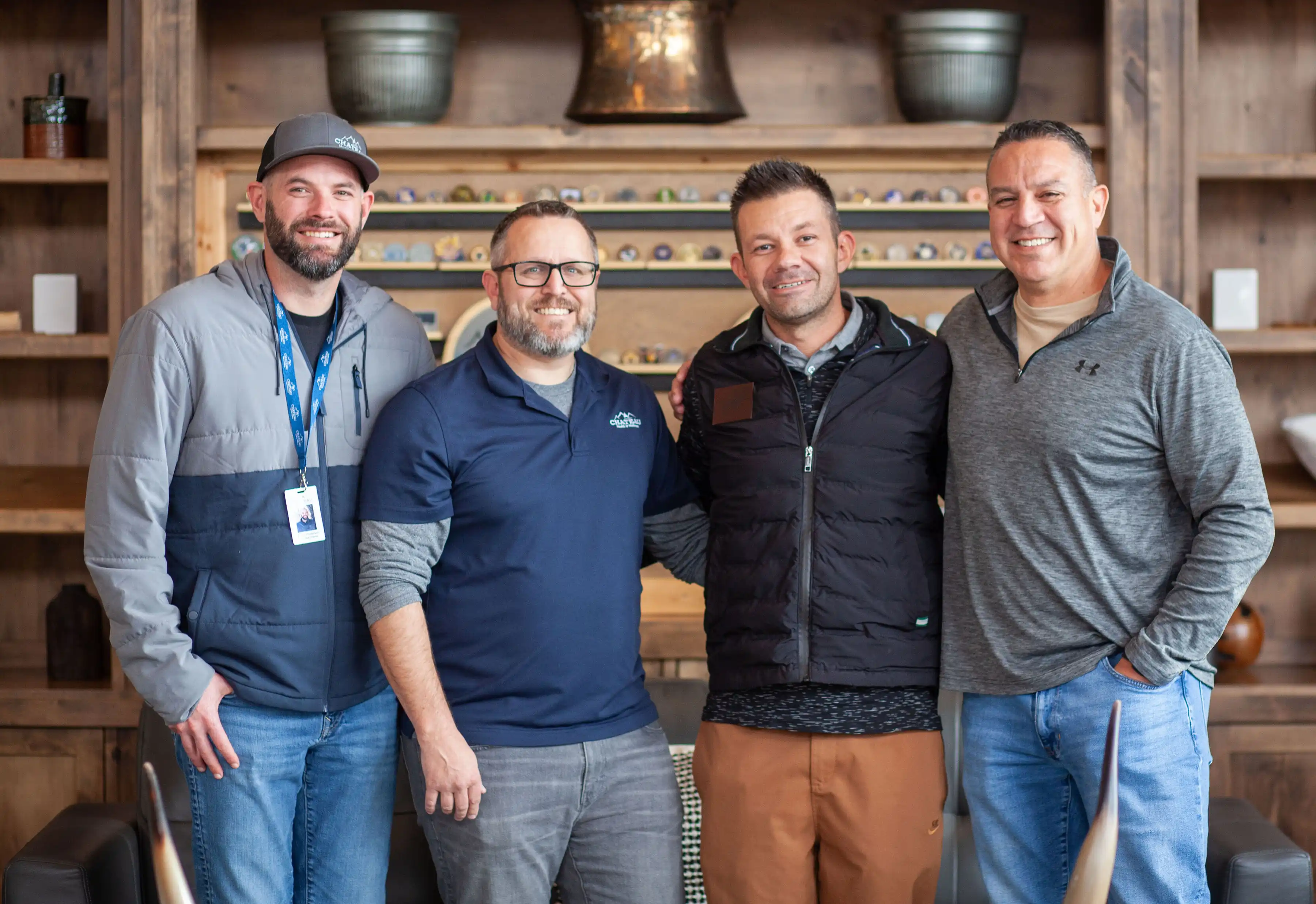
First Responders
Support for PTSD, trauma, depression, anxiety, and substance use, built for the culture.
- Confidential, structured care
- Family support options
- Admissions support for employers
A single-page reference of the Chateau brand system: logo, color, typography, buttons, overlays, spacing, cards, and photography. Sourced from the project's preview library and design tokens. For internal share-out and partner handoff.
Chateau Health & Wellness provides intimate, trauma-informed residential treatment in Utah's Wasatch Mountains, serving first responders, veterans, and professionals.
Joint Commission-accredited with Master's Level Clinicians. Ages 26+ only. FOP Approved Wellness Provider since 2012.
All inquiries are 100% confidential. (435) 222-5225 · Oakley, Utah
All photographic surfaces use the near-black cinematic family. Orange overlays are deprecated. Use the directional sweep for hero, the bottom fade for cards, the center wash for testimonials, and the subtle wash for decorative section tints.
Support for PTSD, trauma, depression, anxiety, and substance use, built for the culture.
Guidance for spouses, parents, and families, plus next steps that actually reduce uncertainty.
Care designed for working adults and established life patterns, privacy, and performance.
We treat the whole person through evidence-based therapies combined with wellness practices.
Solves: preserves a full-bleed cinematic feel while guaranteeing legibility. Image opacity dropped to 55% under a 0.85→0.20 directional gradient — heading clears ~13:1 and body copy ~9.5:1, comfortably above WCAG AA 4.5:1.
Solves: zero contrast compromise — image at full opacity on its side, text on pure white. Body ≈ 12.6:1, heading ≈ 9.7:1. Best for environmental hero shots worth preserving faithfully.
Solves: editorial, calm presentation — image contained in an inset rounded frame. Same contrast as Variant 2 with a "card-within-card" feel. Best for program-directory lists with many banners in sequence.
Solves: maximum cinematic impact — image at 100% with a one-sided dark scrim (0.05 → 0.85 black) behind text only. White heading ≈ 17:1; body (white 0.88) ≈ 12.5:1. Editorial serif-italic ghost CTA replaces the prior burnt-orange pill.
“Meeting the highest standards in healthcare quality and safety.”
First-responder-specific tracks, peer support, and confidentiality built for the culture.


